In the ever-evolving world of web design, CSS3 stands as a cornerstone for crafting visually appealing websites. Shadows and neon effects on text have become integral to modern web aesthetics, adding depth, dimension, and a futuristic touch. Let’s embark on this journey, starting with the basics.
Understanding Shadows in CSS3
Shadows in CSS3 allow you to mimic the interplay of light and objects, providing a sense of depth and realism. They can be applied to text, boxes, or any element on your webpage. The key properties to grasp are box-shadow and text-shadow.
Box Shadows
Box shadows can transform flat elements into lifelike objects. They have several properties, including:
- offset-x: Horizontal shadow position;
- offset-y: Vertical shadow position;
- blur-radius: Controls the shadow’s blurriness;
- spread-radius: Adjusts the shadow’s size;
- color: Sets the shadow’s color.
Example:

Creating Text Shadows
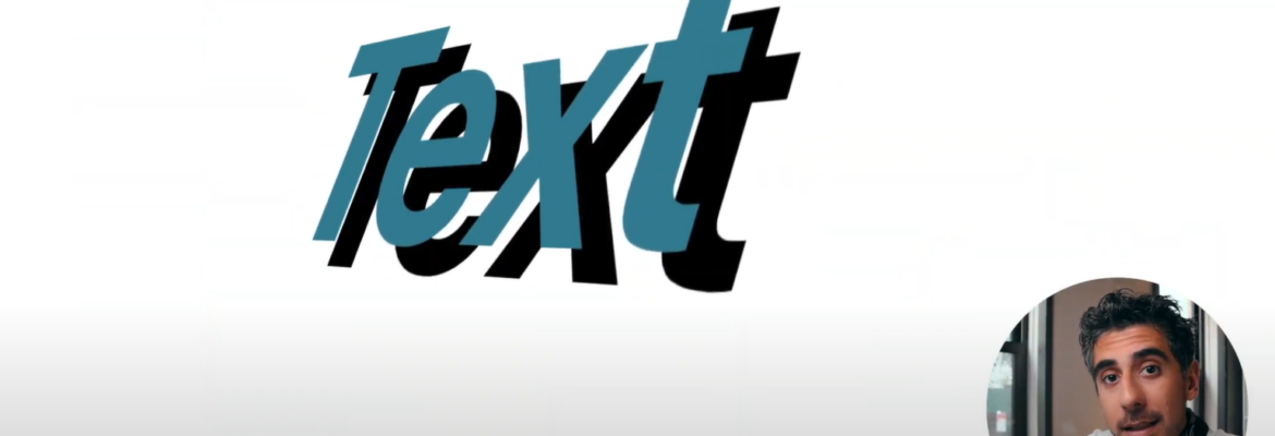
Text shadows add depth and style to your typography. They share properties with box shadows but are tailored for text elements.
Example:

Playing with Box Shadows
Box shadows provide versatility in design. You can stack multiple shadows to create complex effects. For instance, a button with a pressed look can be achieved by combining shadows.
Example:

Creating Text Shadows
Text shadows can breathe life into your headings and paragraphs. Experiment with different offsets and colors to find the perfect fit for your content.
Example:

Combining Shadows for Depth
To achieve depth and complexity in your designs, layering shadows is key. By altering the opacity and blur radius, you can create subtle or dramatic effects.
Example:

Neon Text Effects: A Modern Trend
Neon text effects are all the rage in contemporary web design. They infuse a sense of vibrancy and futuristic appeal. Let’s explore how to achieve these eye-catching effects.
CSS3 Neon Text Basics
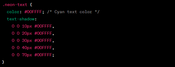
Creating neon text involves two main elements: the text color and the glowing effect. It’s achieved by setting a bright text color and adding a glowing halo around it.
Example:

Adding Glow to Text
The key to neon text is the glowing effect. Play with the text-shadow properties to control the glow’s intensity and spread.
Example:

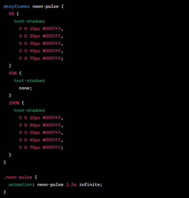
Animating Neon Text
To make your neon text truly captivating, you can add animations. CSS3 animations bring your text to life with pulsating, flickering, or scrolling effects.
Example:

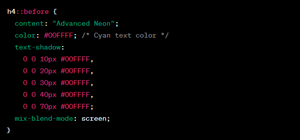
Advanced Techniques for Neon Effects
To take your neon text to the next level, explore advanced techniques like using pseudo-elements, gradients, and blending modes.
Example:

Applying Shadows and Neon Effects Responsibly
Now that you’ve acquired a deep understanding of shadows and neon effects in CSS3, it’s essential to learn how to apply them responsibly. While these techniques can undoubtedly enhance your web design, they should be used judiciously to maintain a clean and user-friendly interface. Here are some practical tips to keep in mind:
- Subtle Shadows: For most elements, opt for subtle shadows that provide a slight lift without overpowering the design. Reserve heavy shadows for specific focal points;
- Readability Matters: Text shadows, especially neon ones, can affect readability. Ensure that your text remains legible, even when applying neon effects;
- Cross-Browser Compatibility: Not all browsers support the latest CSS3 features uniformly. Test your designs across multiple browsers to ensure consistent rendering;
- Performance Considerations: Complex shadow and neon effects can impact page loading times. Strike a balance between aesthetics and performance;
- Accessibility: Make sure your web content remains accessible to all users, including those with disabilities. Use accessible color contrasts and provide alternative text for images.

Leveraging CSS Frameworks and Libraries
While mastering CSS3 for shadows and neon effects is essential, you can also leverage CSS frameworks and libraries to streamline your workflow. These tools offer pre-built components and styles that can save you time and effort. Here are some popular options to consider:
CSS Frameworks:
- Bootstrap: Bootstrap is a widely-used CSS framework that includes a variety of pre-designed components, including buttons, cards, and navigation bars. It also offers a straightforward grid system for layout;
- Foundation: Foundation is another robust CSS framework that provides a responsive grid system and a set of UI components. It’s highly customizable and ideal for building responsive websites.
CSS Libraries:
- Hover.css: Hover.css is a collection of CSS3 transitions and animations for adding subtle interactive effects to your elements, such as buttons and links;
- Animate.css: Animate.css is a library that offers a wide range of pre-defined animations to make elements on your website come to life;
- Box-Shadows.io: This library provides a user-friendly interface for generating complex box shadow CSS code. It’s especially handy for creating intricate shadow effects.
Conclusion
Congratulations! You’ve embarked on a journey through the world of shadows and neon effects in CSS3. These skills will empower you to create visually stunning web designs that captivate your audience. Whether you’re adding subtle shadows for depth or crafting mesmerizing neon text, CSS3 offers endless possibilities. Keep experimenting, stay creative, and watch your designs shine!
FAQs
Text shadows in CSS3 add depth and style to typography, making it visually appealing and engaging for users.
To create a neon text effect, set a bright text color and add a glowing halo around it using the text-shadow property.
Yes, advanced techniques include using pseudo-elements, gradients, and blending modes to create unique and captivating neon effects.
Yes, you can use CSS3 animations to add pulsating, flickering, or scrolling effects to neon text.
Shadows and neon effects enhance the aesthetics of web design, adding depth, dimension, and modern appeal, ultimately improving user engagement.

