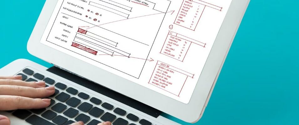
In the landscape of web design, the right panel serves as a versatile element, playing diverse roles from navigation to advertisement placement. Crafting it to perfection not only boosts aesthetic appeal but also enhances user experience.
This guide dives deep into the nuances of designing a flawless right panel using HTML and CSS, ensuring that web designers have the knowledge arsenal they need to succeed.
Establishing the Basic Framework Using HTML
The foundational layer of any webpage element, HTML (HyperText Markup Language), remains pivotal in shaping the anatomy of a right panel. To construct a cohesive and functional panel, one must initiate by structuring it adeptly.
Building the Structure for the Right Panel:
- Containers: To demarcate and house the content of the right panel, initiating with a <div> container proves fundamental. This segment encapsulates all the constituents of the right panel.
- Example: <div class=”right-panel”>…</div>
- Navigation & Links: Facilitating user navigation remains at the heart of any right panel. Implementing <a> tags allows web designers to pave digital pathways, guiding users to diverse sections or resources.
- Example: <a href=”https://www.examplelink.com”>Resource</a>
- Incorporating Content: Whether it’s showcasing the latest blog posts, advertising banners, or a quick search bar, the right panel often hosts varied content. Using a mix of tags like <p>, <img>, and <form>, web designers can enrich the panel with diverse elements.
- Example: <img src=”advert-banner.jpg” alt=”Advert”>
Once the skeleton has been structured through HTML, the platform is set for infusing aesthetics with CSS.
Transcending Aesthetics with CSS
Cascading Style Sheets, popularly known as CSS, is the magic wand in a designer’s toolkit that transforms basic HTML elements into visually appealing components. This style sheet language breathes life into web elements by dictating their visual properties, ensuring that every element, including the right panel, is not merely operational but also aesthetically engaging.
Unraveling the Layers of Right Panel Design:
- Background & Themes: In the digital design realm, backgrounds act as the canvas. They set the tone and ambiance for the contained elements. With the background properties, designers can:
- Introduce solid colors: background-color: #f4f4f4;
- Apply gradient effects: background: linear-gradient(to right, #0099ff, #ffff00);
- Embed captivating images: background-image: url(‘image-path.jpg’);
- Adjust the background’s positioning, size, and repeat patterns.
- Typography & Text Attributes: Typography is a critical element in design that ensures clarity and sets the mood. It encompasses:
- Font Selection: Choosing the right font can reinforce the brand’s identity. Example: font-family: ‘Arial’, sans-serif;
- Size and Weight: Adjusting font size (font-size: 16px;) and weight (font-weight: bold;) caters to readability and emphasis.
- Text Decoration & Transformation: Properties like text-decoration and text-transform allow for stylistic changes like underlining or converting text to uppercase.
- Element Spacing & Arrangement: A clutter-free and organized layout is pivotal for user experience. Using CSS properties, designers can:
- Set external and internal spacing using margin and padding respectively.
- Control the layout flow with display properties (display: block; or display: inline;).
- Utilize the flexibility of the flexbox or grid systems to design complex layouts.
Combining HTML’s foundational strength with CSS’s visual flair, web designers can meticulously design a right sidebar that harmonizes with the overall design and serves its functional purpose.
Responsive Design & Right Panel Adaptability
In today’s multifaceted digital realm, it’s paramount for designs to be adaptable across devices of varied screen sizes. The right panel’s responsiveness ensures its usability and appeal remain consistent across desktops, tablets, and mobiles.
Ensuring Right Panel Fluidity:
- Media Queries: Using media queries, designers can apply styles based on device characteristics. For instance, changing the right panel’s width on mobile devices.
- Example: @media (max-width: 768px) { .right-panel { width: 100%; } }
- Example: @media (max-width: 768px) { .right-panel { width: 100%; } }
- Flexible Grids: Adopting relative units like percentages instead of fixed units ensures that the layout resizes according to the screen’s width.
- Example: .right-panel { width: 25%; }
- Example: .right-panel { width: 25%; }
- Flexible Images: Ensure images within the right panel resize within their containing elements.
- Example: img { max-width: 100%; height: auto; }
This adaptability ensures that the right panel’s design remains optimal, regardless of the user’s device.
Conclusion
The right panel, an integral component of many web platforms, plays a pivotal role in enhancing user engagement and streamlining navigation. Through adept use of HTML and CSS, web designers can ensure this element is not only visually cohesive with the broader web platform but also responsive and user-centric.
As the web continues its dynamic evolution, the prowess to design and adapt such crucial web elements becomes indispensable for designers navigating this digital frontier.

