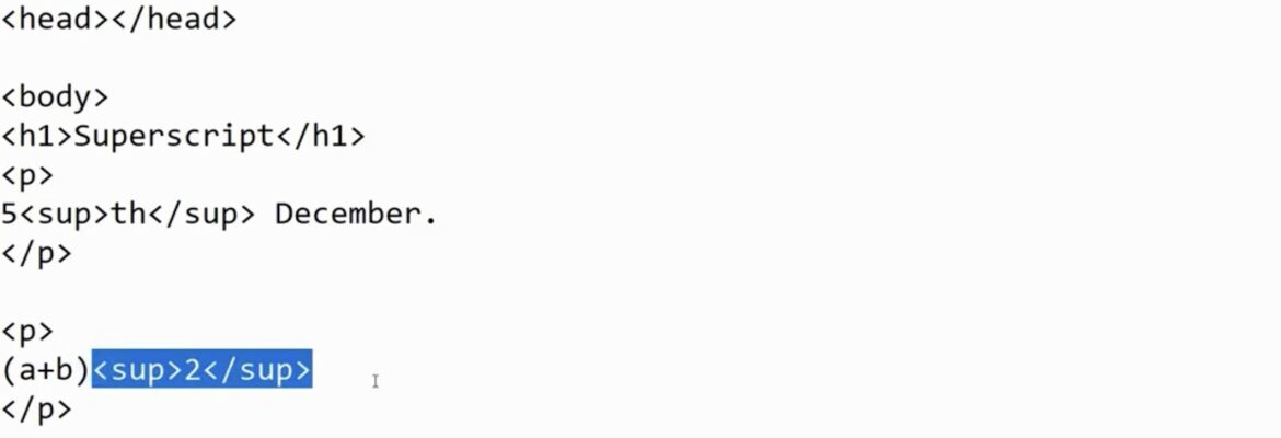
In the world of web design, superscript is a handy tool to add that extra touch of finesse to your text. It’s achieved using the <SUP> tag, much like other text decorations. But let’s delve deeper into its possibilities.
Basic Superscript Magic
In its simplest form, the <SUP> tag operates as follows: In this narrative, text remains ordinary, <SUP>then gracefully ascends to become superscript,</SUP> before gently returning to its usual self. When this is displayed on a webpage, it unfolds like this: In this narrative, text remains ordinary, then gracefully ascends to become superscript, and once again returns to its usual self.
This basic transformation, akin to a text ballet, lays the foundation for the artful application of superscript in web design. Just as a dancer perfects their moves, web designers refine their use of the <SUP> tag, choreographing it seamlessly into their content to achieve both style and substance.
Elevating Superscript with Style
Elevating your superscript game often involves making the typeface slightly smaller for enhanced readability. The degree of reduction depends on the browser and the font used. Controlling this aspect requires some styling, and there are various ways to achieve it.
The Smart Approaches
Starting with the most common and robust methods:
- You can set the font size as a specific percentage, such as 75%:
In this narrative, text remains ordinary, <SUP STYLE=”font-size:75%”>here the superscript font size is reduced to 75%,</SUP> and here the text returns to normal.
- Alternatively, you can opt for fixed settings like smaller, small, x-small, or xx-small:
In this narrative, text remains ordinary, <SUP STYLE=”font-size:xx-small”>here the superscript font size is reduced to xx-small,</SUP> and here the text returns to normal.
On the page, these styles manifest as follows: In this narrative, text remains ordinary, here the superscript font size is reduced to 75%, and here the text returns to normal. In this narrative, text remains ordinary, here the superscript font size is reduced to xx-small, and here the text returns to normal.
Going Big with Superscript
Should the need arise for superscript with a larger font size than the regular text:
In this narrative, text remains ordinary, here the superscript font size is increased to 150%, and here the text returns to normal.
Choosing Your Path
The choice between these methods is a matter of personal preference. Some font types benefit from percentage-based adjustments for improved readability. However, it’s crucial to test these approaches on various browsers when designing webpages.
Caution with Fixed Font Sizes
While it might be tempting to use a fixed font size, it’s not always the best route. If you opt for a fixed size, say 10.0pt, you can easily set the superscript to 8.0pt: In this narrative, text is 10.0pt, <SUP STYLE=”font-size:8.0pt”>here the superscript font size is reduced to 8.0pt,</SUP> and here the text returns to 10.0pt.
Conclusion: Mastering Superscript for Web Design
In the intricate world of web design, harnessing the power of superscript can elevate the aesthetics and readability of your content. This journey began by understanding the fundamental <SUP> tag, which, like other text decorations, adds that touch of elegance. As the narrative unfolded, the text transformed gracefully into superscript and returned to its normal state, showcasing the basic use of this tag.
To truly master superscript, we explored various styling options. Adjusting the font size as a percentage or employing fixed settings like smaller, small, x-small, or xx-small offered flexibility and control over the appearance of superscript. These styles, when applied, added finesse to the content and enhanced its visual appeal. Yet, a cautionary note emerged when considering fixed font sizes. While tempting, they may not harmonize with your webpage’s global font choices. Opting for a percentage-based approach often led to more consistent and visually pleasing results.
In the end, the choice of superscript style depends on personal preference and the specific needs of your design. Web designers must tread carefully, testing and fine-tuning their choices across various browsers to ensure a seamless and visually captivating user experience.

