In the ever-evolving realm of web design, harnessing the potential of opacity and rgba colors has emerged as a defining characteristic of visual finesse. Whether your aim is to infuse grace into your images or craft captivating transparent gradients, these methods are your passport to exploring a fresh dimension within your web projects.
Opacity: Unveiling the Art of Transparency
Opacity, a concept familiar to graphic designers and web developers alike, is a powerful tool for introducing transparency into web page elements. Its application extends to both text and images, allowing you to achieve varying degrees of transparency.
Let’s see how it works in practice:
- Consider text on a white background with 50% opacity:
<SPAN STYLE=”background-color:#FFFFFF; opacity:0.5; filter:alpha(opacity=30)”>and here the opacity and filter are set to 50%</SPAN>
As a result, we get the following image:

Opacity can be applied to images, which opens up creative possibilities. Here’s a comparison of an image with and without 50% opacity:
<IMG SRC=”Graphics/StarsAndStripes.gif” STYLE=”opacity:0.5; filter:alpha(opacity=30)”>
<IMG SRC=”Graphics/StarsAndStripes.gif”>
The result:

It is important to note that opacity is applied to the element style, so it is not possible to make background images transparent without affecting the content of the top image. A workaround is to use file formats that support transparency, such as PNG, and apply a transparent image as the background.
RGBA Colors: Where Color Meets Transparency
RGBA colors introduce transparency directly into the color code, providing more flexibility in creating transparent backgrounds without affecting everything inside the element. Let’s look at the difference between using opacity and rgba colors:
<DIV STYLE=”background-color:#FFFFFF; opacity:0.5; filter:alpha(opacity=30)”>Text on white background using opacity and filter</DIV>
<DIV STYLE=”background-color:rgba(255,255,255,0.5)”>Text on white background using rgba</DIV>
The result:

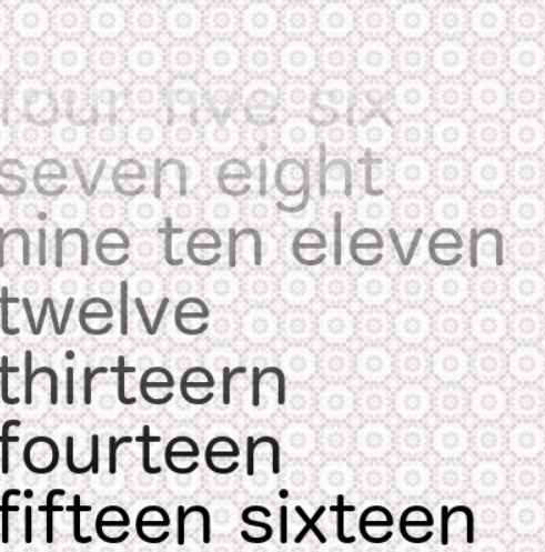
RGBA colors are truly magnificent when it comes to opacity gradients. Similar to color gradients, rgba colors can be used to create opacity gradients between two different levels of transparency. This can be especially useful for creating smooth transitions between elements or backgrounds, especially in older versions of browsers that don’t fully support opacity. Here’s an example:
<STYLE>
.OpacityGradient {
background: #FFFFFF;
background: -webkit-linear-gradient(left, rgba(255,255,255,0), rgba(255,255,255,1));
background: -o-linear-gradient(right, rgba(255,255,255,0), rgba(255,255,255,1));
background: -moz-linear-gradient(right, rgba(255,255,255,0),rgba(255,255,255,1));
background: linear-gradient(to right, rgba(255,255,255,0), rgba(255,255,255,1));
}
</STYLE>
<DIV CLASS=”OpacityGradient”>Text on clear to white background using opacity gradient</DIV>
Result:

Opacity gradients can be further customized by changing parameters such as slope angle, type, and others, just like traditional color gradients. These techniques open up a wide range of possibilities for creating attractive web designs that stand out from the crowd.
Conclusion
Opacity and rgba colors stand as fundamental assets in the toolkit of a contemporary web designer. These elements wield the power to govern transparency levels, infusing web elements and backgrounds with intricacy and elegance.
Whether your aspiration is to introduce nuanced improvements or craft awe-inspiring transparency gradients, honing these skills will elevate your web design prowess. In an ever-evolving digital landscape, proficiency in leveraging translucency and rgba colors ensures that your work remains at the vanguard of visual aesthetics.

