In the dynamic landscape of web design, typography plays a pivotal role in shaping the user experience and conveying the message of a website. While horizontal text has been the conventional choice for presenting content on the web, the art of web typography has evolved significantly. As designers and developers strive to create unique and engaging layouts, the use of vertical and angled text in HTML has emerged as a powerful technique to capture attention, convey emotions, and enhance the overall visual appeal of web pages.
In this article, we embark on a journey into the world of vertical and angled text in HTML, exploring the techniques, benefits, and creative possibilities they offer. Whether you’re a seasoned web professional looking to expand your design repertoire or a newcomer eager to delve into the realm of web typography, this guide will equip you with the knowledge and inspiration needed to make your web designs truly stand out. Join us as we unlock the secrets behind crafting captivating vertical and angled text within.
Understanding the Complexity of Vertical Text Across Browsers
Navigating the intricacies of displaying vertical text can be a challenging venture, especially given the substantial discrepancies that exist among various browsers. For web developers or anyone interested in web design, understanding these nuances is essential for creating visually appealing and functional web content.
Inherent Differences among Browsers
Browsers interpret and render vertical text differently, necessitating vigilant observation of settings coordination. In most cases, the need for vertical text arises within the content of a table cell but can extend to instances like image descriptions or other textual elements. To effectively render vertical text, browsers generate an element akin to a floating DIV, positioned above the intended text item, creating a layering effect. This phenomenon emphasizes the need for meticulous attention to detail, ensuring a harmonious integration between text elements and their vertical counterparts.
Nuances of Text Rotation
Rotating text involves altering its position in the x-y plane, meaning it can move up, down, left, or right. However, it’s noteworthy that Internet Explorer didn’t support this feature until the ninth version. Although rotation and shifting are technically distinct and adjustable parameters, browser configurations commonly intertwine them, presupposing a desire to relocate text when rotating it. This interaction may seem counterintuitive, but it’s a peculiar aspect that developers must contend with in the realm of web programming.
Key Considerations and Recommendations
- Compatibility Check: Regularly test vertical text rendering on different browsers to ensure uniformity and avoid discrepancies. Tools like BrowserStack can be invaluable for this purpose;
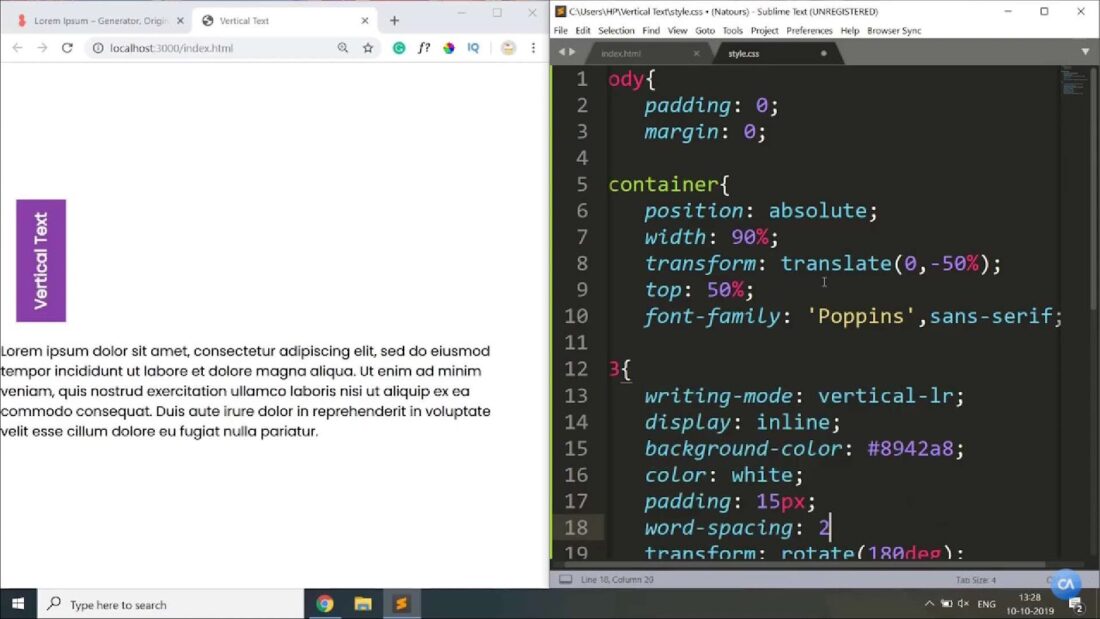
- CSS Styling: Employ appropriate CSS properties and values, such as writing-mode or transform, to control text orientation and alignment accurately;
- Fallbacks and Polyfills: Given the erratic support for vertical text in older browsers, implementing fallbacks or using polyfills can help maintain design integrity across varying browser environments;
- Optimal Use Cases: Determine where the utilization of vertical text is most suitable, keeping in mind readability and user experience, and refrain from overusing it;
- SEO Implications: Search Engine Optimization is vital for web content; hence, understanding how vertical text affects SEO is crucial. Employ SEO best practices to ensure the text is indexed correctly.
Deepening Understanding
Acquiring a profound knowledge of browser behaviors and mastering the art of handling vertical text can significantly enhance web design outcomes. This involves exploring the vast array of browser peculiarities and developing strategies to mitigate the potential adverse effects of these variations. By continually refining skills and acquiring new insights, developers can overcome the inherent challenges posed by vertical text rendering and create more versatile and user-friendly web experiences.
Creating Elegant Vertical Text in Web Design
Vertical text can be a captivating design element that adds a unique flair to your web page. However, achieving this effect isn’t always straightforward. In this guide, we’ll explore a step-by-step approach to create stylish and readable vertical text for your website. We’ll also address browser compatibility issues and provide valuable tips for fine-tuning the appearance.
1. Choosing the Right Method
In principle, you can apply vertical text styling directly to the text element, but this often leads to messy and unreadable code. Instead, it’s advisable to create a dedicated class in your stylesheet. Let’s call this class “VerticalText.” By using a class, you maintain code organization and make it easier to apply the same style to multiple elements if needed.
2. Rotating the Text
To start, you’ll want to rotate the text 90° counterclockwise to create the vertical effect. Depending on the browser, you’ll need to use different CSS properties to achieve this rotation. Here’s an example of the code for various browsers:
- Mozilla Firefox: -moz-transform: rotate(270deg) translate(0px,0px);
- Opera: -o-transform: rotate(270deg) translate(0px,0px);
- WebKit (Safari and Chrome): -webkit-transform: rotate(270deg) translate(0px,0px);
- Internet Explorer (6, 7, 8, 9+): filter and ms-transform properties with rotation values
3. Handling Internet Explorer Compatibility
It’s essential to note that earlier versions of Internet Explorer (6, 7, 8) have limited support for text rotation compared to modern browsers. In these cases, you’ll need to use the filter property for rotation, but newer versions of IE (9+) can use the ms-transform property.
4. Specifying Float and Position
Since the page treats the text field as a floating DIV, it’s advisable to specify the float property to ensure consistent rendering across different browsers. float: left is a common choice, but testing is essential to determine the best fit for your specific design.
Additionally, specifying position: absolute is a good practice. Not all browsers default to this for vertical text, so setting it explicitly ensures consistent behavior.
5. Defining Width for Vertical Text
Specifying the width of the text field is highly recommended for vertical text. In this context, the width effectively becomes the height of the text. As vertical text floats above the horizontal text, setting a width prevents the text from extending indefinitely. For example, you can set a width of 200px in your class:

.VerticalText {
  width: 200px;
  float: left;
  position: absolute;
  /* Rotation properties here */
}
6. Implementation
After defining the “VerticalText” class and applying the necessary styles, incorporating vertical text into your web page is straightforward. Simply use the following HTML code:
<DIV CLASS="VerticalText">My vertical text</DIV>7. Fine-Tuning for Aesthetic Appeal
While getting vertical text to function is relatively simple, making it visually appealing can be time-consuming. To streamline the process, consider the following trick:
- Mark the area where you want the vertical text, specifying the height and width of the container (e.g., table cells or DIVs) as necessary;
- Add borders to the text area, including invisible elements if it’s a table. These borders serve as visual guides;
- Adjust the position of the text field in the x-y plane while referencing the sight lines provided by the borders;
- Once positioning is precise, remove the borders used as sight lines.
By following these steps and considering browser compatibility, you can create elegant and readable vertical text that enhances your website’s design. Remember that practice and experimentation are key to achieving the desired aesthetic.
Conclusion
In conclusion, the use of vertical text in HTML has evolved from being a relatively obscure feature to an increasingly popular and valuable tool in web design and content presentation. As we’ve explored throughout this article, vertical text can be employed for a variety of purposes, such as creating eye-catching headings, enhancing user experiences, and optimizing space utilization.
By delving into the various CSS properties and techniques available for implementing vertical text, we’ve empowered web developers and designers with the knowledge needed to harness this powerful feature effectively. Whether it’s rotating text, transforming individual characters, or designing complex layouts, the flexibility of vertical text in HTML opens up exciting possibilities for creativity and innovation.

